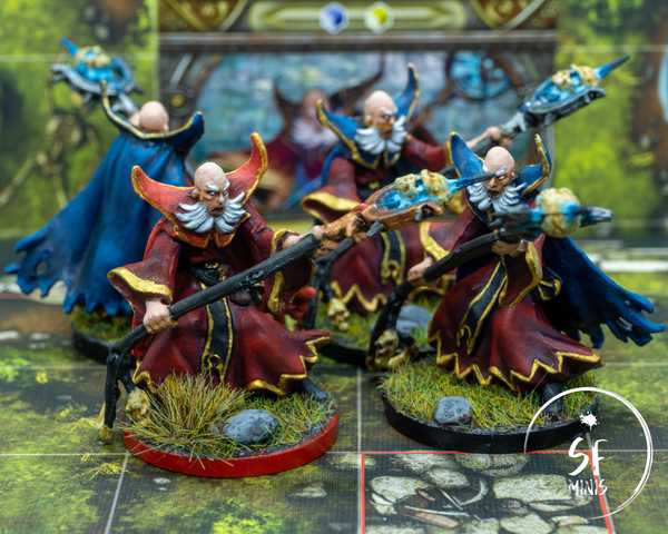
These guys were a welcome challenge on different fronts.
On one side, they were the first group of minis that I painted from Descent. Their sculpts were generally pretty good, definitely better than the base game ones, but some of the places were a bit hard to reach.
Generally, wargame miniatures are easier to paint because you have to assemble them. You can prime and paint them first, and put them together and touch up later.
With boardgame miniatures, however, this is not the case. They come pre-assembled, which means that some areas may be more difficult to paint properly.
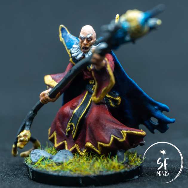
One such case is the inner cape of these guys here. The miniature in general is fairly straightforward, but getting the brush to leave paint in these recessed areas was more of a challenge than I had thought. Luckily, they generally need to be darker than the rest of the miniature, which means that you can prime black, pass a zenithal grey coat which will not apply there, and then only pass 1 or 2 hands of thin colour to give the desired hue. Job done there.
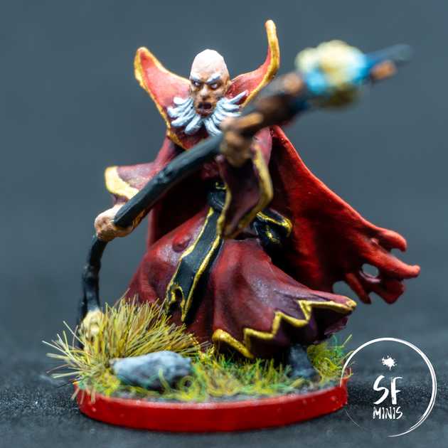
The other challenge I faced was how to distinguish masters from minions better than just the base colour. I ended up giving the two some different colour schemes: master would have a red cape and jewel, bronze staff head and red base.
Minions would respectively have blue, silver and black instead.
I think I have gotten better at painting red clothing than blue, since I’ve had more practice with it. I use glazing to achieve depth within clothing folds, going from a lighter to a darker colour. In this case, however, I added too much contrast initially, and the transition was too swift, so I had to glaze up as well from dark to bright, which surprisingly worked better than I had expected! I was generally satisfied with the result, especially with the master.
Once I settled on these differences, I also decided to play a bit with the colour of the tunic. Starting from a darker shade of red, I also applied some dark purple glaze to the recessed areas, and then finished it with the normal process of darkening up via glazing and brightening the raised areas with highlights. It turned out quite well, although I’m not sure if the purple has remained as much as I wanted it to.
Another thing I experimented with was the fuming skull. I wanted to achieve the effect of a skull lighting up from the inside with a blu-ish hue, and I think I got that to a degree I’m satisfied with. I first painted the skull to a bright beige, then used Citadel Contrast Paints to give it depth. Once that dried, I started from a larger, darker blue colour around the skull, on the spikes and the metal frame, and progressively brightened it up with a lighter hue in smaller areas. Then I topped it by doing the same to the eyes and making their center very bright.
The last thing I am going to talk about are the details - specifically, the golden seams around the neck collar, tunic and sash. These turned out well enough, but I think I can definitely improve my brush handling abilities and make them more precise. I will soon receive some better brushes, since the ones I have now tend to split very easily, so hopefully this will make me more productive and less prone to errors.
Overall I’m pretty happy with how these turned out. I spent about 8 to 10 hours on them, and I think they will look great on the table!


